You’re likely among the thousands of ecommerce brands losing $18 billion in annual sales revenue due to cart abandonment.
Now, you’re looking to optimize your checkout processes (doing so can increase sales revenue by up to 35%).
While you should never optimize blindly—and optimizations will differ based on your data—there are a few general changes that most ecommerce brands should make. In this article, we’re covering exactly why your cart abandonment rate might be so high and how to decrease it.
1. Reasons Why Cart Abandonment can Impact your Ecommerce Site
Customers have to have three things to follow through on a purchase: motivation, ability, and trigger (according to the Fogg Behavior Model).
- Motivation: the internal desire or need for change, which can be heightened by external factors like price, an economic downturn, photos, influencer endorsements, testimonials, and product reviews.
- Trigger: an external stimulus to fill that need or want immediately, such as a promotion, urgency (like a holiday shopping event), or free shipping for a certain amount of items purchased.
- Ability: how the other two work together to reach a target behavior, such as buying. In retail, this comes in the form of accurate inventory, shipping options that meet their needs, and a smooth checkout process without surprises.
Remove one (or complicate one), and customers are likely to abandon their cart, if they even get that far.
The ability is where most ecommerce brands falter. Some of the most common reasons for cart abandonment include:
- Additional shipping fees
- Unexpected or high taxes and fees (more likely to be a factor during periods of inflation)
- Being forced to create an account
- Slow page loading speeds
- Discount codes not working
- Having to re-enter previously entered information
- Shopping cart complexity (and time it takes to reach confirmation)
The pattern with each of those is friction on the customer’s way reaching the end goal, particularly when it’s an unexpected barrier.
Shipping fees may be something most customers expect. But when those fees far exceed what the customer anticipates, it becomes a barrier to purchase.
Shops on the popular marketplace Etsy face this challenge rather often. Take this example of a storage basket on Etsy:

The basket is attractive, the price is reasonable, and it’s on sale. There’s motivation and a trigger. There’s even a sense of urgency with the addition of an end-of-sale timer counting down in your checkout.
However, you aren’t able to see the shipping costs until you enter your shipping and billing information. It’s only then that you see the cost to ship the basket is far above the cost of the item itself.

As a merchant, recognize that unexpected shipping costs and additional fees are a barrier to conversion.
The same goes with any other hoop your customers might have to jump through in their checkout process. For example, you may think you’re creating a long-term customer by forcing the buyer into creating an account, but something as simple as this causes around 34% of customers to abandon their cart.
Likewise, it may seem beneficial to collect more details about your customers in a long checkout form—perhaps in the hopes of using that data to improve your business—but research proves that it drives around 26% of your customers from their cart checkout.
Even a long page loading time is enough to reduce your conversions. In fact, it’s one of the largest contributors to high cart abandonment rates, and a factor that hurts your brand long term since 80% of those customers won’t return.
Most customers expect a certain process at checkout: pick your items, enter shipping and billing information, hit submit, and get a confirmation.
It’s a straight line to their goal. Deviate from that set expectation, and the items they wanted suddenly aren’t worth it.
2. Reducing Cart Abandonment Rates on your Ecommerce Site
The extent of checkout optimization you’ll need to undergo depends entirely on your cart abandonment rates and its causes.
Even without these insights, you can take actions to simplify and optimize checkout processes. A few of the easiest ways to do this include:
- Adding a progress indicator to your checkout page
- Showing product images throughout the entire checkout process
- Provide all costs upfront
- Offer multiple payment and shipping options
- Implement a one page checkout
Those are simple optimizations that nearly every ecommerce website can benefit from, and that are fairly easy to implement.
However, there are other UX and marketing methods that may have a much larger impact on conversions and reducing abandonment rates.
Abandoned Cart Emails (and Templates)
While the retail industry standard for email open rates sits at 15%, abandoned cart emails achieve a whopping 45% open rate.
More than half of them receive click-throughs and result in a purchase.
Translation: abandoned cart emails are highly effective at driving your customers back to their carts.
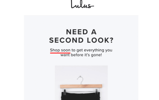
To see how they work, look at this abandoned cart email example from the retail brand Lulus.
The subject line is simple and clear: “reminder: you still have items in your cart”. The format of the abandoned cart email is just as simple and clear, and that’s part of what makes it so effective.
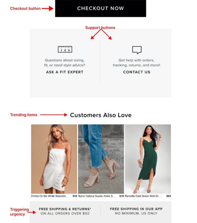
Notice that there are a couple of touchpoints within the email that create a sense of urgency, or a trigger to get you back to your cart: free shipping for items over $50 and mentioning “shop soon… before it’s all gone.”

They’ve also added a support feature with “contact us” and a bonus attraction, “ask a fit expert,” which is fairly unique to see a retailer offer.
Showing other top trending items with some personalization to the customers’ style adds motivation to the email, pulling a customer back to their previously loved items and to new items as well.
Lastly, they’re making it exceptionally easy to return to purchase with that CTA button “Checkout now.” It sends the message that they’ll be transported immediately to an easy checkout.

Bury Products with Higher Abandonment or Lower Rankings/Reviews
We call this process “searchandising,” because it involves properly placing merchandise within search results and category pages to optimize for specific business KPIs.
The right product discovery platform (PDP) uses AI to surface items that have the highest rates of abandonment or customer dissatisfaction (poor reviews and low sales are good indicators).
Depending on what KPIs the merchandising team wants to optimize for, the AI can automatically boost products that have a high inventory, sell well, are on sale, have a high margin, or are part of a recent campaign.
It can also bury the products that are out of stock or are continuously abandoned in carts. These products won’t show up at the top of search results or browse pages, giving priority to items that tend to sell better.
This wouldn’t be possible without separating your abandoned cart actions from real conversions, which your PDP should be able to do.
Hyper-personalization
Personalization is about sending the right messages to the right customers at the right time or stage in their buyer journey using the right delivery method. Sometimes the right delivery method is on your website itself, in real time.
Ways to hyper-personalize for lower cart abandonment rates on an ecommerce website:
- Tailor browse and search experiences to provide more relevant or attractive products based on the individual buyer’s clickstream data.
- Make on-site recommendations that more closely match their taste (an opportunity to upsell)
- Personalizing your abandoned cart emails with the items in their cart and additional recommendations (as shown in the Lulus abandoned cart email example)
- Tailoring search results based on demographics (location, gender, age)
Let’s take a look at the second of those recommendations in action on the Bonobos– a men’s clothing brand– website.
After spending just a few minutes exploring their site, you’ll start to see hyper-personalized recommendations at the bottom of product pages.

Now, it’s not necessarily new to show product recommendations. But with the right AI and clickstream data, the customer will see items they’ve previously looked at rather than simply related items.
When you take advantage of this optimization opportunity, your customers will feel like your site was built just for them (with all of their favorite things). A better buyer experience will always lead to greater conversion rates.
Retargeting Ads
Similar to abandoned cart emails, retargeting ads are highly effective at bringing customers back to their checkout page.
Of the three quarters of your customers that notice the retargeting ad, 26% return to checkout.
Most retailers opt for placing their retargeting ads on social media sites, particularly Facebook and Youtube.
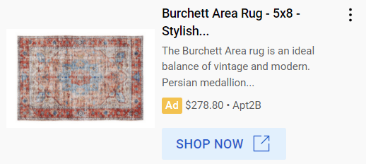
Here’s a great example of a Apt2B retargeting ad on Youtube:

Notice that they’ve placed the price, product image, and a link to shop for that item directly.
Not only are they bringing you back to a product you’d previously looked at and considered, but they’re producing all the information you need to consider it again, followed by an easy purchase link.
There are other forms of retargeting ads—banners at the bottom or top of a page, sponsored facebook ads, sidebar ads on blogs, and even Google search ads—but the most effective among them are personalized.
Even segmenting your retargeted audiences for different behaviors on your site can increase retargeting ROI by 1,300%.
Create a Short and Easy Checkout Process
26% of shoppers abandoned carts because the checkout process was too complex and too long.
When the average form contains 23.48 elements and 14.88 form fields, it’s easy to see why they wouldn’t stick around. Optimized checkout processes have just 12 form elements and 7 form fields.
Other optimizations for a checkout process:
- Keeping the entire process on a single page
- Allowing the customer to see the entire process with a progress bar or numbered drop down sections
- Showing the items in their cart throughout the process
- Showing the fees upfront
- Autofilling their details (credit card information, billing address, name)
One great example of an optimized checkout comes from Backcountry apparel.
They’ve limited their form fields to the most essential for shipping and receipt purposes, skip making customers enter billing information if it’s the same as their shipping address, and provide varying shipping and payment options.
There are a few additional sections on their checkout page, such as expedition perks, donation opportunities, and a promo code application option.

While these sections do make the process appear slightly longer at first glance, it remains an easy and quick process to the end.
3. How your Product Discovery Platform can Help Reduce Cart Abandonment
It’s a challenge to optimize your checkout processes when nearly every ecommerce product discovery platform counts “add to cart” events as conversions.
They’re not conversions. In fact, counting your add-to-cart events as such is detrimental to your sales, and prevents you from gaining real insights that allow you to make the right optimizations.
To get around that, you need a certain level of AI built into your PDP.
It’s too challenging to identify patterns of abandonment among large product catalogs and gain enough insights into why certain items have a higher click rate yet low conversions.
An AI-first, ecommerce-first product discovery platform surfaces insights and optimizes customer experiences for your entire catalog based on specific metrics and the KPIs you set. This same platform also won’t lump your abandoned carts in with purchases when reporting on conversion metrics.
You’ll gain a greater understanding of where your sales really stand, and what’s really contributing to your cart abandonment rate.
The Ultimate Guide to Searchandising with Constructor
Learn how ecommerce AI – not just any AI – improves KPIs and team efficiency. Get the Ebook here.
