Recommendations are an essential component of a successful ecommerce product discovery strategy. Yet the best way to maximize your outcomes with Recommendations is to formulate a strategy. At Constructor, this is where we step in.
Partnering closely with our customers, we’ve led experiments and identified some best practices that consistently improve KPIs, year in and year out.
In this guide, we’ll show you the critical components of a successful ecommerce recommendations strategy that you can start to develop before or after your integration. These are the same product recommendation strategies our ecommerce partners use to achieve significant lifts in revenue.
Let’s get started!
Fundamental Building Blocks
To optimize your site experience, you’ll combine the recommendations results engine with UX elements like visual cues and keywords to achieve a business goal.
.png?width=700&height=350&name=recommendation-strategy-cheat-sheet@2x%20(1).png)
An example strategy statement using the building blocks above might be:
“To increase average order value (AOV) by 1.5%, we plan to place complementary recommendations on product description pages, the add-to-cart modal, and the checkout page with a 10% discount.”
In this guide, we’ll look at four foundational building blocks of a complete ecommerce recommendations strategy:
- The key types of product recommendations available in the Constructor platform
- Business objectives and success metrics
- Optimal placement for each recommendation type
- User experience and design elements that optimize conversion
9 Types of Ecommerce Recommendations
Constructor’s ecommerce recommendation engine currently offers nine different types of results:
- Complementary: Returns products often bought with the product that a shopper is looking at, or has in their cart.
- Bundles: Optimizes for products that are likely to be added to cart as a whole set with the primary product on a product detail page (PDP).
- Alternative: Returns similar type products. This can be an effective strategy when there are many choices and a shopper would benefit from a curated list of similar products.
- Filtered: Returns products restricted by a preset product attribute. This can be used to curate recommendations to products similar to the viewed item.
- Best Sellers: Returns the most popular items for a specific time frame (up to the past 30 days). Similar to User Featured, this can be used to encourage exploration high in the funnel.
- User Featured: Returns products that users are most likely to convert on based on their individual behaviors and affinities.
- Recently Viewed: Returns shoppers’ own recently viewed products. This can bring shoppers back to items in the same session or serve as a quick jumping-off point to continue a previous session.
- Abandoned in Cart: Recommends items that shoppers have added to shopping carts but have not purchased yet.
- Query Recommendations: Returns products after shoppers land on a zero-results page. Improve the page by showing products that other shoppers went on to engage with after making the same query.

Business Objectives
Product recommendation strategy planning is an iterative process that requires intent, planning, measurement, and refinement. Regardless of your starting point, it’s critical to ask “Why?” with your recommendations program.
- Are there specific business objectives recommendations are meant to achieve?
- How are our recommendations performing now?
- How are we measuring success for our recommendations campaigns?
- How will I know if my ecommerce product recommendations strategy has succeeded?
The answers to those last few questions will rely on the metrics that you use to measure and define success. Popular KPIs include AOV, revenue per visitor (RPV), profit margin, conversion rate, abandoned cart rate, and customer lifetime value (CLV).
Product recommendations can support various (and even sometimes competing) strategies to ultimately generate more revenue for the retailer. Here are four primary examples:
Cross-selling
Cross-selling involves recommending additional products that are complementary to the items a shopper has added to their cart. This strategy’s goal is to increase RPV and AOV.

Bundle recommendations
Bundles provide shoppers with well curated sets of items they are likely to purchase together. Recommending bundles when shoppers are ready to buy is an effective strategy for increasing items in basket and AOV. Bundle recommendations combine a specific user experience — the ability to add more than one item to cart at once — with powerful AI algorithms to recommend items bought together as a set.

Upselling
Upsells are recommendations of alternative products with higher price points (or margins) than the items a shopper has shown interest in. Upselling can be used to drive higher AOV and profit margin.

Acquiring new customers
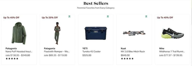
First time shoppers are looking to make a connection with your brand. To achieve this goal, you can use visual elements that create a sense of trust and show that others have used and liked the product. In the example below, a new shopper might appreciate recommendations for items on sale and those that feature customer ratings. These strategies might help increase first-time conversion rate.

Building loyalty
Research shows increasing customer retention rates by 5% increases profits by 25–95%. Personalizing results and regularly showing recommended products to shoppers keeps them coming back as repeat purchasers.
Powered by clickstream data and machine learning, Constructor recommendations begin personalizing as soon as a user first clicks or searches on your site. The user-featured strategy provides personalized product recommendations based on each user’s individual history. It also factors in the affinities of other shoppers with similar behavior. Placing these recommendations in strategic points in the customer journey (like on a shopping cart or checkout page) can increase AOV and lower abandoned cart rate.

Regardless of what business metrics the merchant is hoping to influence, it is important to start from a baseline. Determine what data you have now on recommendations success and determine what data you would like to track. No data will ever be perfect upon starting, but the intention is important.
And you can make your merchandising work even easier with an analytics dashboard that provides insights into recommendations performance, like number of sessions, impressions, clicks, and click-through rates (per pod and overall). Answer key questions, adjust strategies, and hit key business metrics like conversions and revenue from one source of truth.

Implementing the User Featured strategy on the home page displays items relevant to the shopper’s past search, behavior, and affinities. This is likely to keep returning customers on site by providing them with attractive items from their very first pageview. (And how do you track those pageviews and past search behavior? With clickstream data, that is.)
Placement
In order for recommendations to reach business goals, they need to appear in the right place at the right time. Recommendations should be placed frequently in appropriate locations that align well with the shopper’s journey and intent.
Here are some of the most effective and common placements for ecommerce recommendations:
- Homepage
- Product detail pages
- Search pages
- Category pages
- Shopping cart
- 404 pages
- Pop-ups
- Email campaigns
In this section, we’ll dive into some use cases and general best practices for each.
Homepage
The homepage contributes to business objectives around attracting new customers and displaying relevant products to returning shoppers.
Use the Best Sellers recommendation strategy to show new customers items that sell well across your entire customer base. This is a great opportunity to show the best your brand has to offer and convert visitors into first-time customers.

Product Detail Pages (PDPs)
Product detail pages are a prime place to increase basket size by cross-selling complementary items or upselling alternative items.
Constructor tested alternative and complementary strategies on product details pages to inform our recommendations on best practice.
In internal A/B tests, we found that complementary recommendation results lead to significantly more users clicking and eventually adding to cart compared to alternative items.
While more people clicked on alternative items, complementary recommendations drove conversions and larger basket sizes.
- The alternative strategy (upselling) drove +8.1% in users clicking recommendations.
- The complementary strategy drove +11.6% in users clicking on a recommendation followed by an add-to-cart and +13.6% in clicks followed by a purchase.
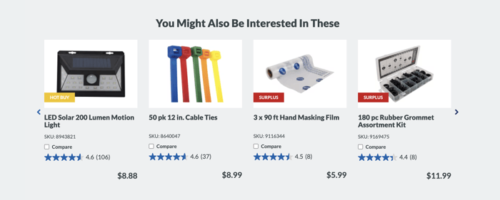
Here’s this strategy at work at Princess Auto, recommending complementary items on product detail page for a kneeling pad:

Category pages
Product category pages drive significant engagement and conversions with your brand.
Use the filtered items strategy at the top of the page to drive personalized recommendations from the category the shopper is currently navigating.
Shopper Profile Pages
Shopper profile pages are effective places to show recommendations to help shoppers continue their previous journey or find new products they are likely to purchase next. A hub for seeing User Featured, Recently Viewed, or Abandoned in Cart can all be stacked in a personalized shopping home page on a profile page. This section could also be introduced to the home page as well in a dedicated section.
Shopping cart
The shopping cart is a primary example of a place to cross-sell shoppers with additional items they might need. Apply the complementary items strategy to promote additional products that shoppers are likely to add to their basket.
The shopping cart is also a prime opportunity to use complementary items or filtered items to display products frequently bought together. This can increase AOV near the end of the shopper’s current buying journey.
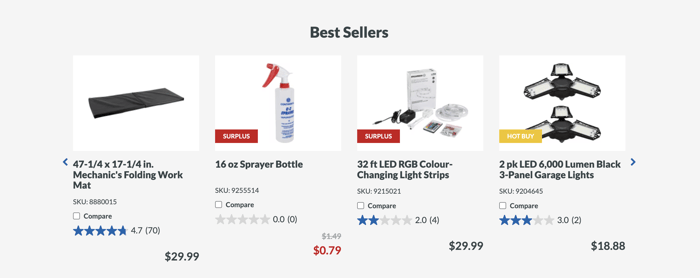
Princess Auto uses this strategy as well, by adding an additional "Best Sellers" recommendations pod to their checkout page.

“No Search Results” or 404 Pages
You can engage shoppers who land on a zero-results or 404 error page by providing them with relevant recommendations. This can keep them from bouncing off your site when they don’t find exactly what they’re looking for.
On zero-results pages, the query recommendations strategy provides results that others have clicked on after reformulating similar zero-result queries. Merchants don’t want to lose this opportunity, and this is an easy fix to help shoppers back on their journey.
404 error pages happen occasionally as well, and all too often, users bounce after this event. Don’t lose them here! Employ a best sellers, user featured, or recently viewed recommendations results page to get users back into the shopping journey.

Pop-ups
Pop-ups with recommended products can re-engage users at critical moments in the customer journey.
For example, when shoppers return to the site, you can display a “pick up where you left off” pop-up showing recently viewed items. Constructor’s user-featured strategy could also help by showing shoppers items personalized specifically for them.
Pop-ups can also be effective immediately upon customers adding items to their cart, presenting a potential opportunity to cross-sell. Instead of a normal confirmation message, a pop-up can recommend complementary items to increase AOV.
Emails
Constructor is an open API-driven commerce platform. That means that you can use it to deliver personalized email recommendations to shoppers in any channel. Merchants can target shoppers in specific cases using email recommendations to bring users back to the site and increase conversion rates.
Some successful implementation of recommendations in emails include:
- Sending personalized emails with the user-featured strategy to drive return site traffic and conversion.
- Sending emails with the recently viewed strategy to pull users back to the site and increase conversion.
- Send targeted, personalized emails to shoppers using the complementary items strategy based on recent purchase behavior.
- Bring shoppers back on site by sending them abandoned in cart recommendations so they can continue their shopper journey.
User Experience and Design
Good recommendation design increases the chance of conversion. Captivating titles, distinct calls-to-action, and striking visual cues that grab attention can increase engagement across all recommendation placements. Eye-catching buzzwords and messaging create urgency and convince shoppers that they need to take immediate action.
Let’s dive into some of these design elements.
Visual cues
Augmenting recommendation results with good UX can improve trust and nudge shoppers towards action. Visual cues are any additional design elements that draw the shopper’s attention and help them engage with the recommendation suggestions.
The following cues have been successful in leading to higher conversion rates:
- Product ratings. Product ratings can lead to higher conversion rates by showing off the good experience other customers have had with the product.
- Discounts. Highlighting discounts on recommended products can trigger shoppers’ desire for a good deal and improve conversion rates. Just be cognizant of your business objectives: discounts might increase conversions but lower AOV, RPV, and margins.
- User-generated images. Offer visual social proof and validation that others have purchased the product and have a favorable opinion of it.

Buzzwords and calls-to-action
Using creative language and compelling calls-to-action helps grab attention on recommendation pods. It helps to think through recommendation placement and the context of where the customer is in their journey.
Creatively naming headlines on top of recommendation pods gives gentle nudges to shoppers on the intended action. For a shirt, you could create a complementary items pod and title it, “Customers Like You Also Bought.” This is different from saying, “Frequently Purchased Together” or “Buy Together.”
Immediately below it, you could even create a second pod called “Complete the Look.” This filtered items pod could present shorts, shoes, and accessories. Shoppers will be exposed to two cross-sell opportunities with strong, active calls-to-action.
Recommendations Building Block Cheat Sheet
The checklist below includes all the building blocks you need. From here, you can combine them and roll them up into a coherent product recommendations strategy.
Reach Ecommerce KPIs with a Compelling Recommendations Strategy
How much are you losing in conversions and revenue without a strong product recommendations strategy? Likely millions, if not more.
The days of “having a hunch” are over. To convert (cold) traffic in a down economy, you need to be strategic about which products you place where on your ecommerce website, and why. And have the support of an AI-powered product discovery platform that will nudge your hunches in the right data-backed directions.

